In 2024, the visual content you share on your Twitter profile isn't just a key to crafting your brand's image; it's the magic ingredient that makes your brand stand out in a sea of sameness. Imagine each image and video you post leaving a lasting impression, making your brand unforgettable at first glance. Enticing, isn't it?
But, did you know? Behind the scenes, Twitter might be cropping and adjusting your precious visuals in ways you never anticipated. That's why understanding Twitter's visual content best practices becomes crucial—it not only enhances user experience but also boosts engagement, turning more eyes towards your brand.
Moreover, as the social media titan Twitter undergoes a series of transformations under new leadership, from Twitter Blue to Community Notes, each new feature is redefining how we interact and present content on the platform. Yet, in this ever-evolving landscape, one thing remains constant: the right image and video sizes are key to capturing your audience's attention.
This article will unveil all the secrets of posting images and videos to Twitter in 2024—from recommended sizes to optimal aspect ratios. Join us as we dive deeper, elevate your Twitter game to new heights.

1. Twitter Profile Image Size
In the dynamic digital arena of 2024, your Twitter profile photo isn't just an image; it's the cornerstone of your digital identity, whether you're representing yourself or a globally recognized brand. This seemingly small square is monumental in narrating your brand's story to the world. With millions of users scrolling through Twitter daily, your profile photo is your first chance to make an impactful statement.
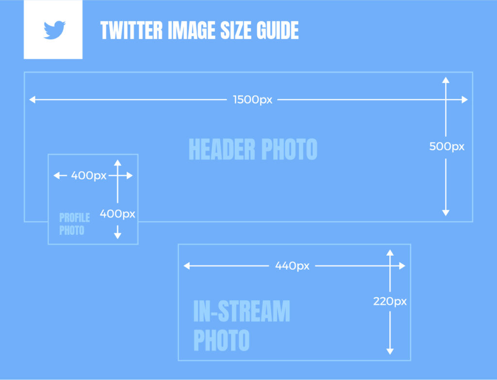
- Dimensions: Adhering to Twitter's recommended 400x400 pixels ensures your image is crisp and clear across all devices.
- Aspect Ratio: The 1:1 aspect ratio is essential, safeguarding your image against unwanted cropping or distortion.
- File Size: Keeping the image under the 2MB limit is crucial for maintaining high resolution while ensuring quick loading times.
Professional insights highlight the importance of consistency across platforms, with studies showing that brands maintaining a uniform visual identity can increase recognition by up to 80%. This underscores the necessity of selecting a profile photo that not only fits Twitter's technical requirements but also aligns with your brand’s overall visual strategy.
Moreover, the transition to circular profile photos on Twitter necessitates a strategic approach to image selection. For individuals, a high-resolution, full-face photo set against a clean background can significantly enhance personal connection with your audience. For businesses using logos, the challenge of fitting square or horizontal logos into a circular frame can be mitigated by opting for a stacked logo design or ensuring the logo is centrally located to remain fully visible.
With the landscape of social media continuously evolving, it's critical to stay ahead with a profile photo that not only meets technical standards but also embodies the essence of your brand. An effectively chosen Twitter profile photo acts not just as a placeholder, but as a powerful tool for brand storytelling and audience engagement.
2. Twitter Header Image Size
In the dynamic world of digital branding, the Twitter header emerges not just as a component of your social media presence but as a pivotal billboard for your brand. As we navigate through 2024, the strategic utilization of this digital real estate becomes increasingly significant for brands looking to carve a lasting impression in the minds of their audience. The essence of leveraging this space lies not only in its visual appeal but also in its ability to succinctly communicate your brand's core message and values.
A well-thought-out Twitter header reflects your brand's identity and values, acting as a silent ambassador to your followers and potential customers. Recent marketing studies underscore the importance of brand consistency, revealing that a unified visual identity across digital platforms can boost brand recall by up to 33%. This highlights the necessity for a harmonious design that aligns with your overall brand strategy. Moreover, the placement of visual elements within the header must be meticulously planned. Given that the profile picture overlaps the bottom left corner, it's crucial to position any vital text or imagery away from this section to ensure maximum visibility and impact.
:
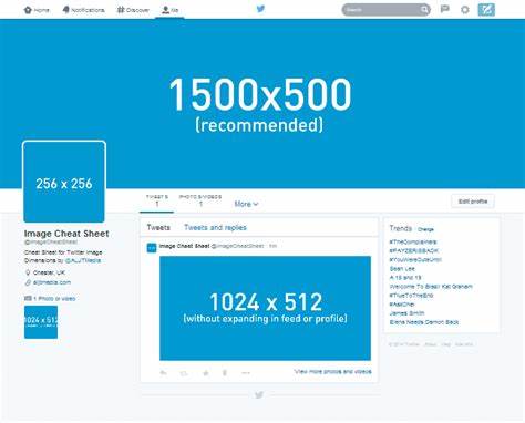
- Dimension Precision: Ideal at 1500x500 pixels, this sizing ensures sharp and clear display across devices.
- Aspect Ratio Mastery: A 3:1 aspect ratio prevents unwanted cropping, preserving your design’s integrity.
- File Size and Format: Maximum file size is recommended at 2MB for optimal load times without sacrificing quality, supporting JPG, PNG, and GIF formats (excluding animated GIFs).
Incorporating these design and technical nuances into your Twitter header strategy does more than just elevate your profile's aesthetic. It ensures that every visitor to your page gets a coherent and immediate understanding of what your brand stands for. Editing and customization of your header should be undertaken with precision, bearing in mind that theme color adjustments need to be done through the Twitter web interface to maintain visual consistency across your digital branding.
Embracing a unified approach to your Twitter header and broader social media visuals fortifies your brand identity, creating a cohesive and memorable brand experience for your audience. As 2024 unfolds, the brands that recognize and act upon the importance of their Twitter header's strategic design and optimized specifications will be the ones that stand out, engaging their audience more deeply and fostering enduring brand loyalty.

3. Twitter In-stream Image Size
In the fast-paced world of social media, visuals play a crucial role in capturing the attention of your audience. Twitter, a platform known for its brevity and immediacy, is no exception. In 2024, leveraging in-stream images effectively can significantly enhance engagement and visibility for your content. Here’s a distilled guide, rooted in professional insights and real-world data, to master the art of Twitter in-stream imagery.
- Landscape Orientation: Aim for a minimum width of 1024x512 pixels. For optimal clarity and engagement, the recommended width is 1600x900 pixels.
- Square Frames: 1080x1080 pixels is the ideal dimension, balancing visibility and detail.
- Portrait Setup: Opt for 1080x1350 pixels to capture vertical imagery effectively.
- Aspect Ratios: Tailor your images with a 2:1 or 1:1 ratio for desktop viewing. Mobile users best engage with 2:1, 3:4, 5:4, or 16:9 ratios, accommodating the variety of devices in use.
- File Size Considerations: Keep images under 5 MB to ensure swift loading times, crucial for maintaining user engagement. Twitter’s platform allows up to 15 MB for images uploaded directly via their website.
Beyond the numbers, a successful Twitter image strategy involves a series of calculated steps to ensure your visuals not only look good but also communicate effectively across different devices. Foregoing unreliable third-party preview tools in favor of direct testing on various devices can reveal how your images will genuinely appear to your audience. With a significant portion of Twitter's user base accessing the platform via mobile, prioritizing mobile optimization can dramatically increase the chances of your content being viewed and interacted with. Additionally, using a private account to test images before they go live can be a valuable step in fine-tuning your visual content, ensuring that it is primed for public viewing.
A deep dive into the usage patterns of over 100,000 Twitter images reveals a noticeable preference for square (1080x1080 pixels) and portrait (1080x1350 pixels) dimensions, accounting for nearly 40% of all images analyzed. This trend underscores a shift towards content that is not only visually appealing but also formatted to stand out in a crowded timeline.
Twitter's flexibility in allowing up to four images per post opens creative avenues for engaging your audience, with the arrangement of images significantly impacting their visibility and the overall aesthetic of your tweet. The platform's support for JPEG, GIF, or PNG formats, including looping GIFs for an added layer of interactivity, presents an opportunity to experiment with dynamic content that can further elevate your Twitter strategy.
4. Twitter Card Image Size
In the fast-evolving digital landscape of 2024, Twitter Cards have emerged as a critical tool for brands seeking to amplify their online presence and engage with their audience more effectively. These rich media attachments offer a unique opportunity to enhance tweets with eye-catching imagery, compelling videos, and direct links to your content, thereby significantly increasing the likelihood of engagement and conversion. Drawing from a synthesis of professional insights and the latest data, this guide provides a strategic blueprint for leveraging Twitter Cards to their fullest potential.
-
Ideal Image Size Range:
- Minimum Size: 300x157 pixels
- Maximum Size: 4096x4096 pixels
- Aspect Ratio Standard: The image sizes cater to Twitter's 2:1 aspect ratio, ensuring a balanced display across devices.
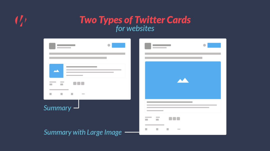
- Summary Cards: Predominantly used for articles and blog posts, these cards should feature images with a 2:1 aspect ratio, fitting dimensions between 120x90 and 120x120 pixels, and maintaining file sizes within 1MB. This specification is derived from analyzing top-performing tweets, which underscore the impact of succinct yet informative visuals on user engagement.
- Player Cards: Designed for multimedia content, these cards require thumbnail images exceeding 350x196 pixels. Optimal aspect ratios of 1:1 and 16:9, along with a 1MB file size limit, are recommended to ensure high-quality previews of audio or video clips.
- App and Website Cards: For promoting mobile applications and directing traffic to web pages, an 800x418 pixel dimension at a 1.91:1 ratio offers the best balance between visibility and detail. In cases where a more square presentation is preferred, especially for app cards, an 800x800 pixel dimension (1:1 ratio) is equally effective.
By embracing these optimized image sizes, aspect ratios, and strategic best practices, brands can harness the full power of Twitter Cards in 2024. This approach not only enhances the visual appeal of your tweets but also significantly boosts engagement, driving meaningful conversations and conversions through tailored, compelling content.
5. Twitter Ad Image Size
In the dynamic digital marketplace of 2024, Twitter continues to stand out as a powerful platform for marketers and entrepreneurs aiming to drive lead generation and sales conversions. With the introduction of lead generation cards and website cards—innovative advertising tools designed to capture user attention and encourage action—Twitter has simplified the pathway to achieving these marketing objectives. Drawing on the latest insights and empirical data, this guide delineates the optimal strategies for leveraging Twitter ad image sizes to maximize campaign efficacy.
#1 Lead Generation Cards: Enhancing User Engagement
- Functionality: Tailored to facilitate the collection of user data, lead generation cards are an integral component of a marketer's toolkit, designed to present an enticing offer alongside a compelling call-to-action (CTA). These cards are pivotal in transforming passive viewers into active leads.
- Professional Recommendation for Image Size: A size of 800px by 200px is recommended, ensuring that the visual content is displayed prominently, capturing user attention without overwhelming the accompanying text.
- Customization and Flexibility: The ability to customize the CTA allows marketers to craft messages that resonate with their target audience, significantly improving conversion rates. Recent trends indicate a preference for succinct, action-oriented CTAs that clearly articulate the value proposition to users.
#2 Website Cards: Driving Traffic with Precision
- Functionality: Aimed at bolstering website traffic, website cards serve as visual gateways to your online content. By combining a banner image with a concise description and direct link, these ads act as a bridge between Twitter users and your digital ecosystem.
- Professional Recommendation for Image Size: For optimal visibility and user engagement, an image size of 800px by 320px is prescribed. This dimension ensures that the banner image is adequately displayed, enhancing the ad's visual appeal while maintaining focus on the descriptive text and CTA.
- Customization and Calls-to-Action: The selection of predefined CTAs offers marketers a strategic tool for guiding user interaction. Analysis of click-through rates across various campaigns has demonstrated the effectiveness of clear, benefit-driven CTAs in maximizing user response.
Empirical data underscores the importance of visual content in digital advertising, with studies showing that ads incorporating optimized images and clear CTAs achieve significantly higher engagement rates compared to those that do not. As the digital landscape continues to evolve, staying informed about the latest trends and specifications in Twitter advertising will remain crucial for marketers looking to maximize their online presence and drive tangible results in lead generation and website traffic.

In conclusion, the strategic optimization of your Twitter visual content is not just about meeting technical specifications; it's about embracing the opportunity to make your brand stand out, engage your audience, and drive meaningful actions. By following the recommendations outlined in this comprehensive guide, brands can elevate their Twitter game, turning visual content into a powerful engine for growth and engagement in 2024 and beyond.


